FRIDAY NIGHT
FIGHTS
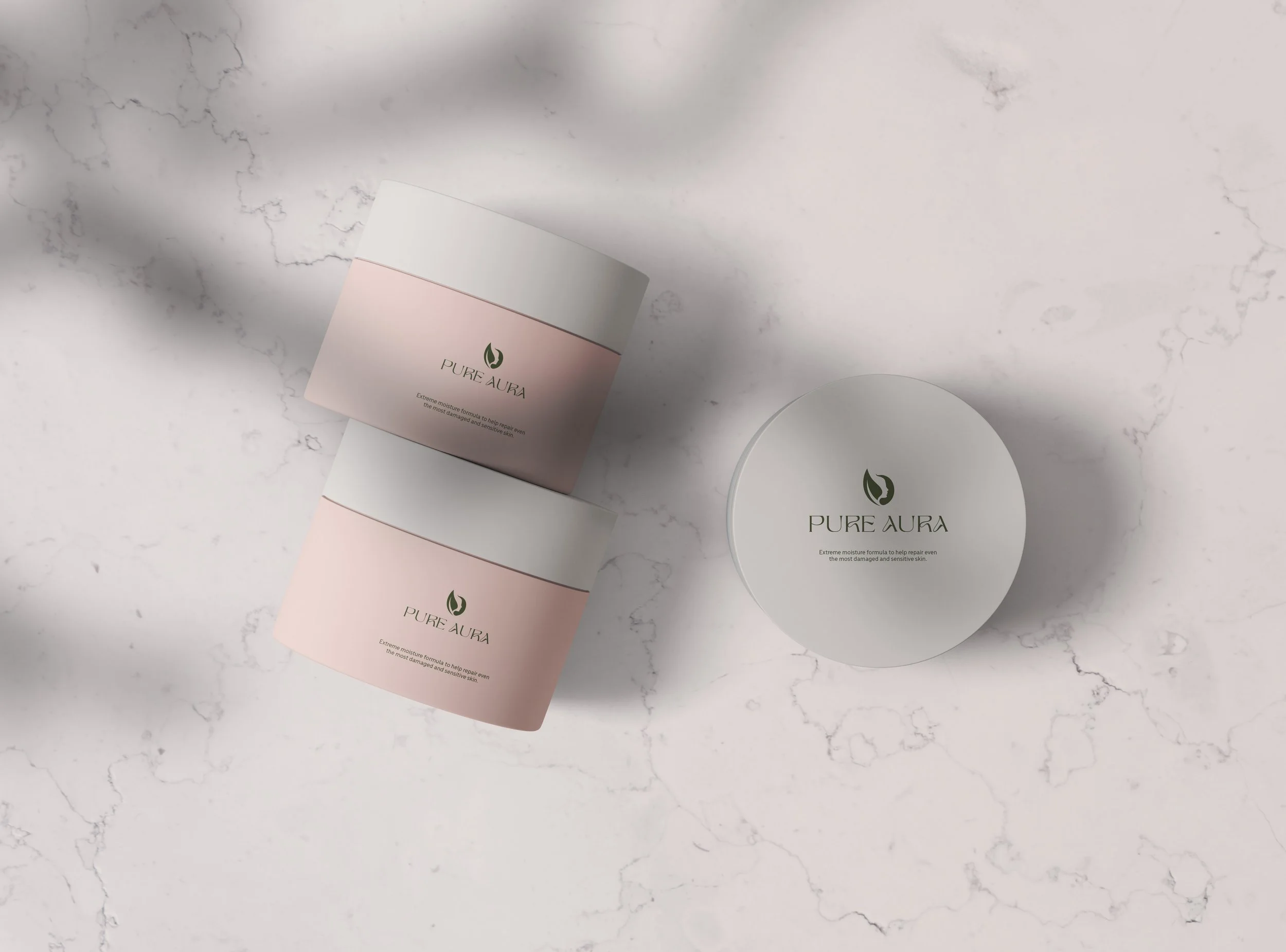
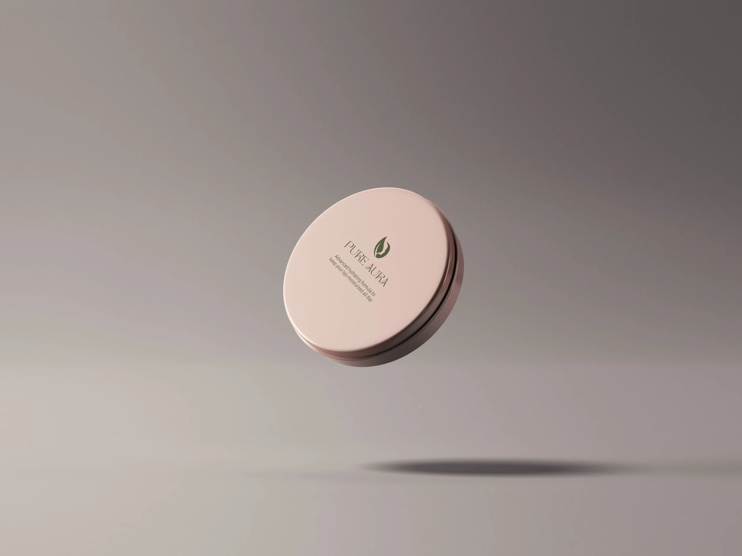
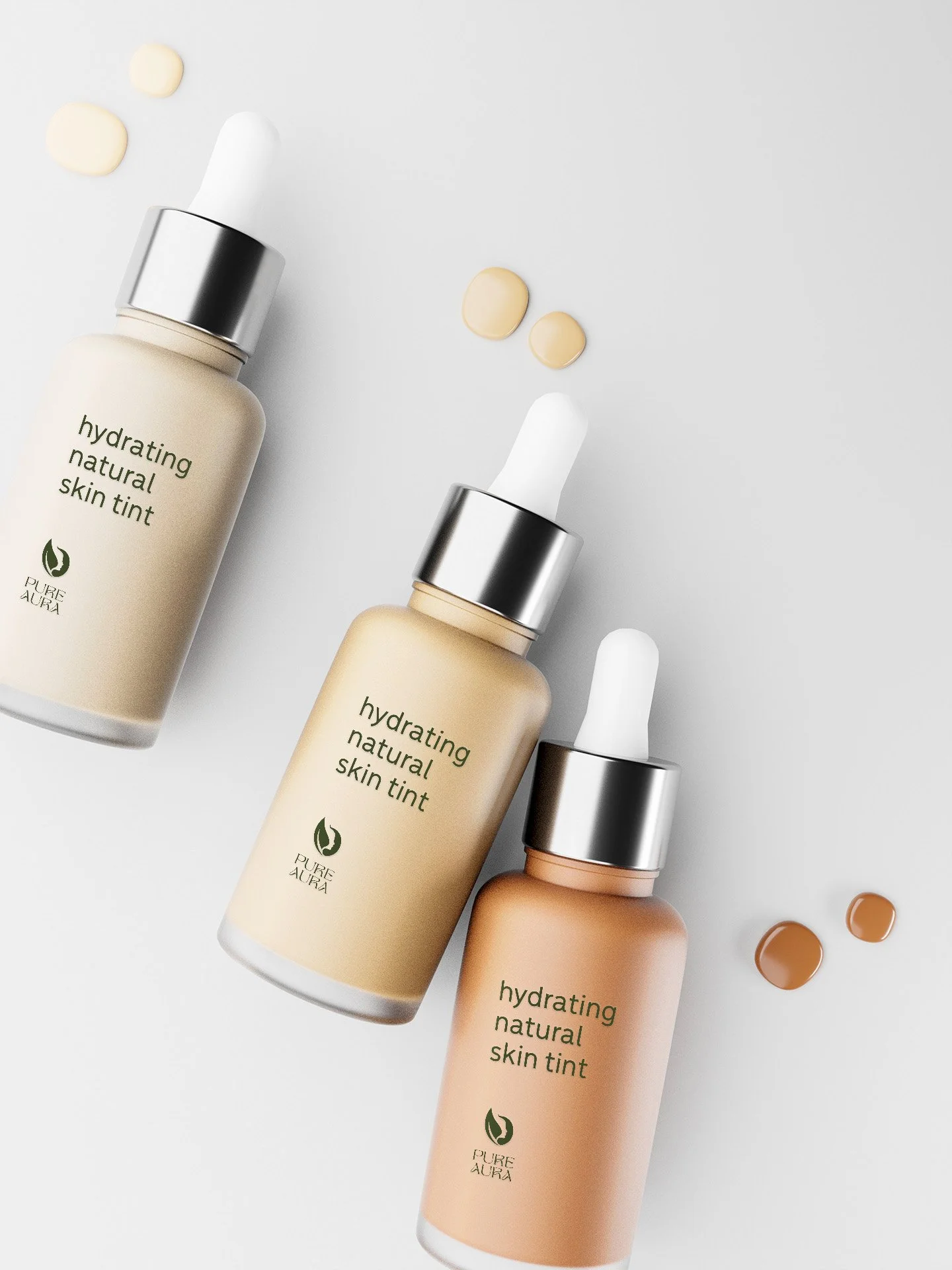
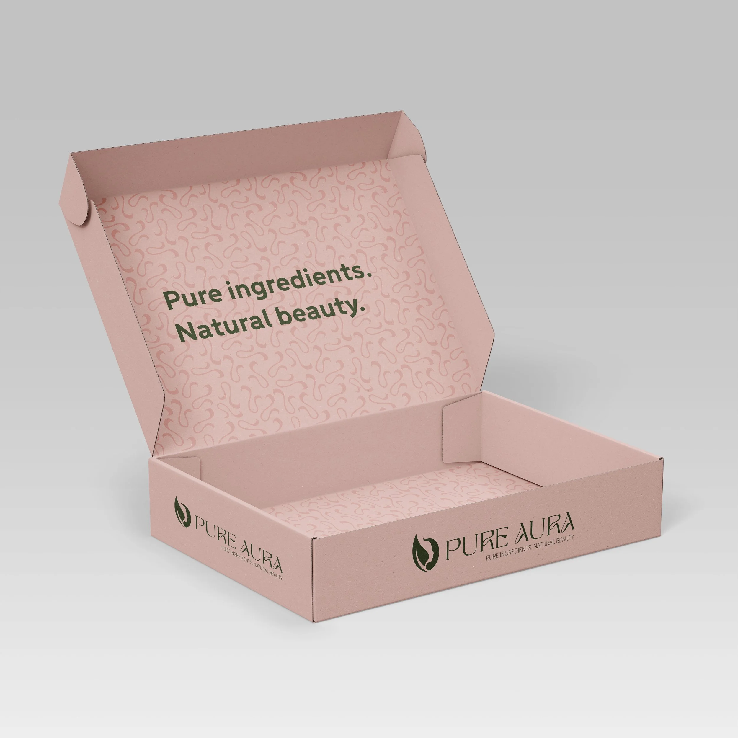
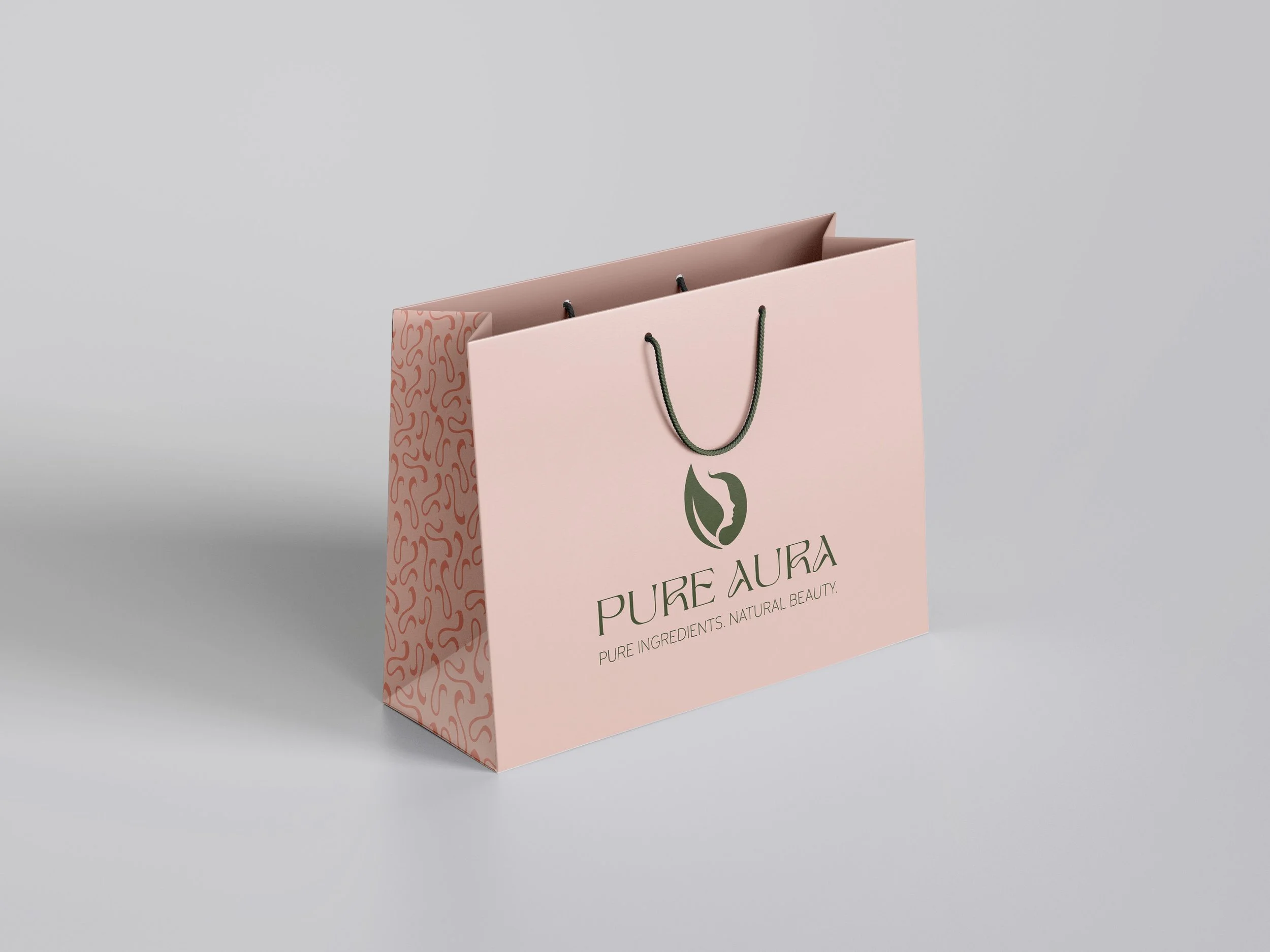
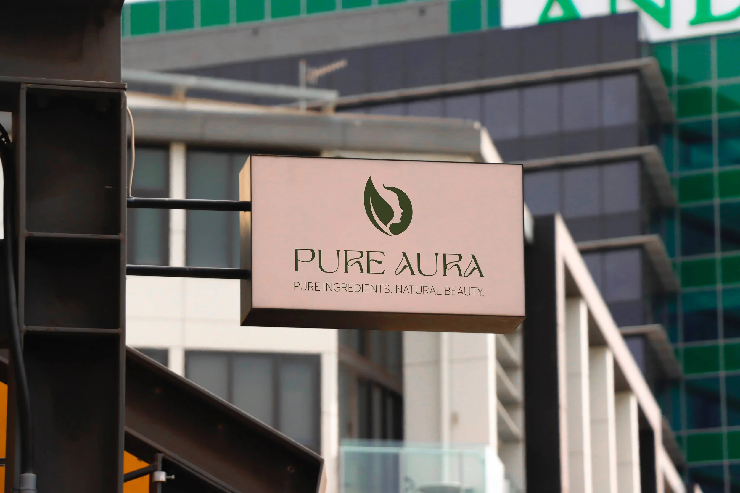
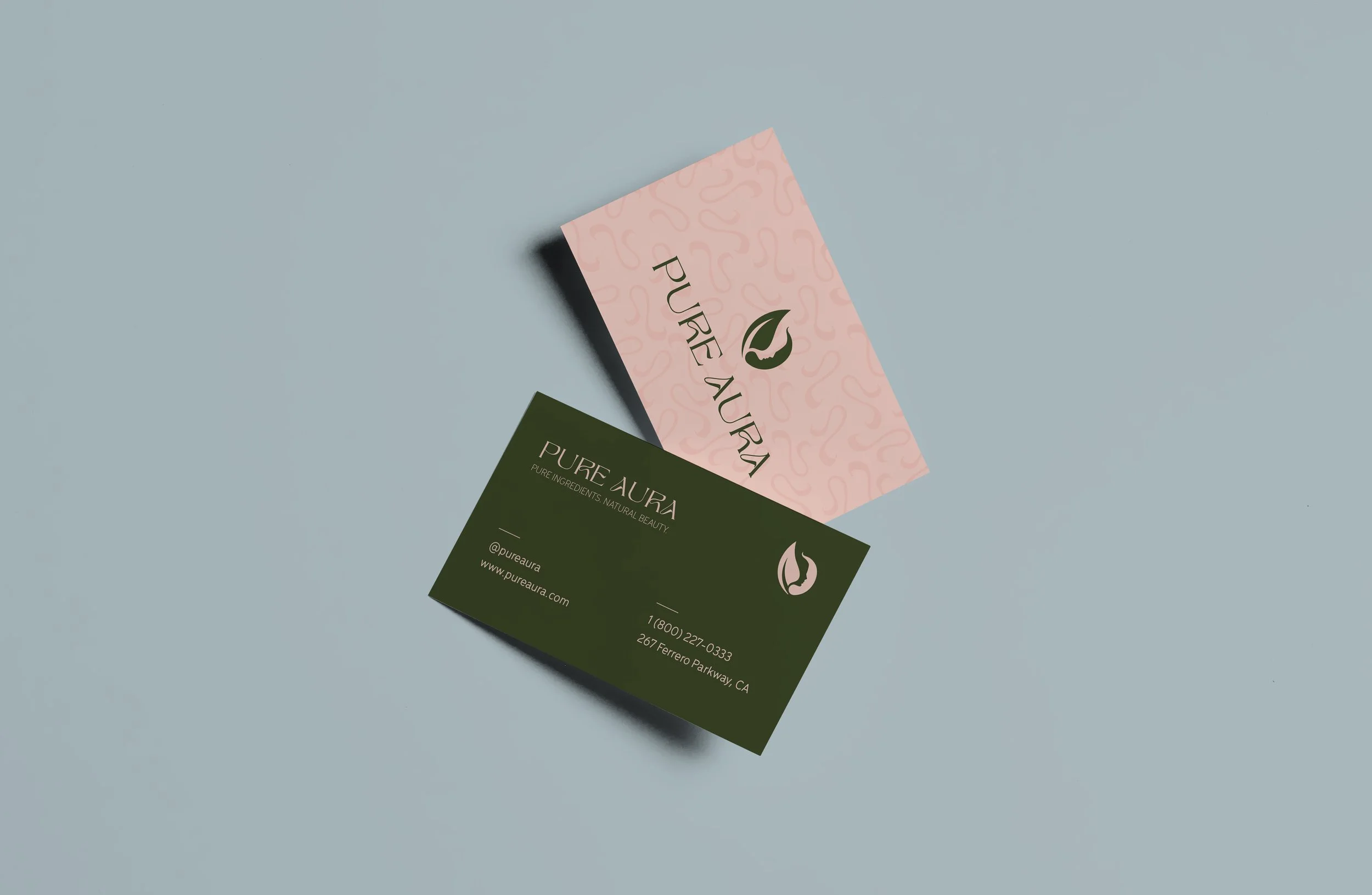
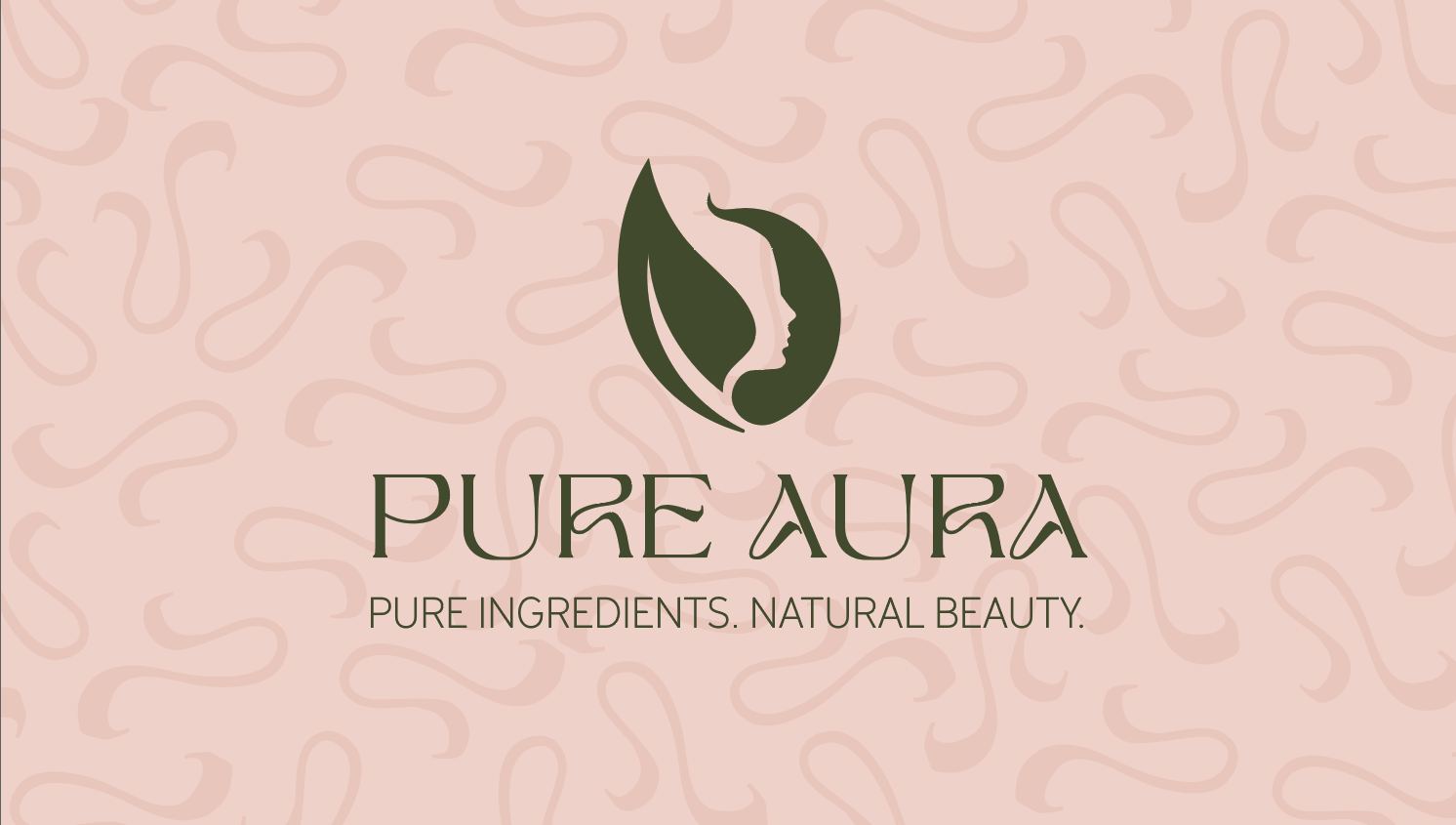
Pure Aura is a conceptual rebrand of Physician’s Formula focused on bringing the brand back to what matters most: natural ingredients, simplicity, and trust. The goal was to create a visual identity that clearly communicates a commitment to clean beauty, especially for people with sensitive skin. I wanted the brand to feel calm, refined, and intentional — something that reflects both the purity of the ingredients and the experience of using the products.
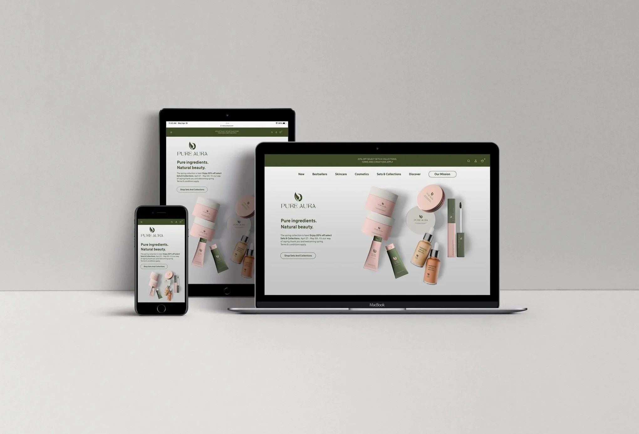
The rebrand leans into a minimalist aesthetic to strip away anything that felt overly complicated or clinical. Instead, the focus is on clarity, softness, and approachability. Pure Aura positions itself as a brand that blends science and nature in a way that feels accessible, creating products that are gentle, effective, and rooted in overall skin wellness.
project journey
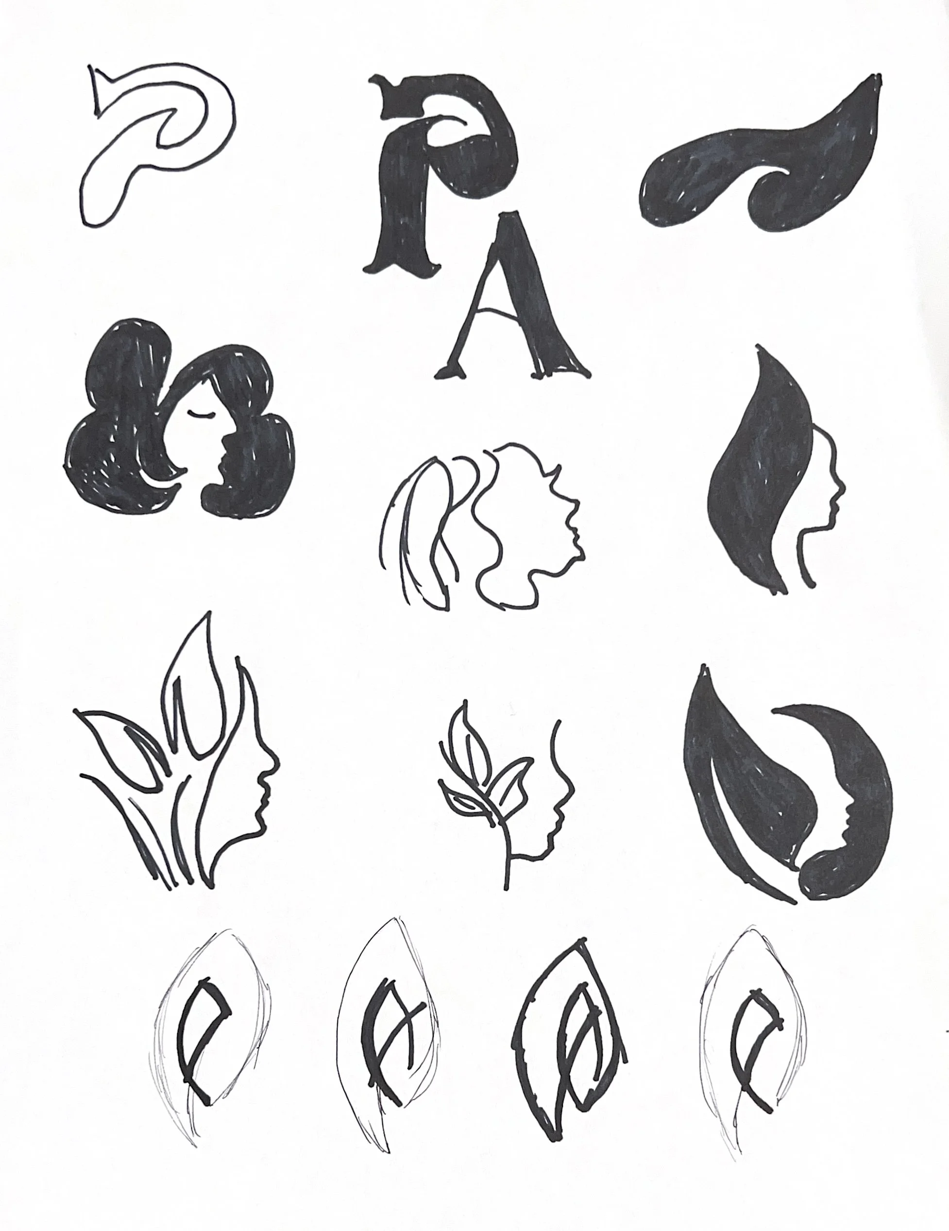
When developing the Pure Aura identity, I focused on finding a balance between something that felt natural and something that still felt elevated and trustworthy. I explored a range of directions, but kept coming back to the idea of combining human-centered beauty with elements from nature. From there, the brand started to take shape through soft forms, clean typography, and a visual language that feels light and breathable.
The process was really about refining — simplifying shapes, stripping back details, and making sure every element felt intentional. I wanted the final identity to feel effortless, but still distinctive enough to stand out in a crowded beauty space.
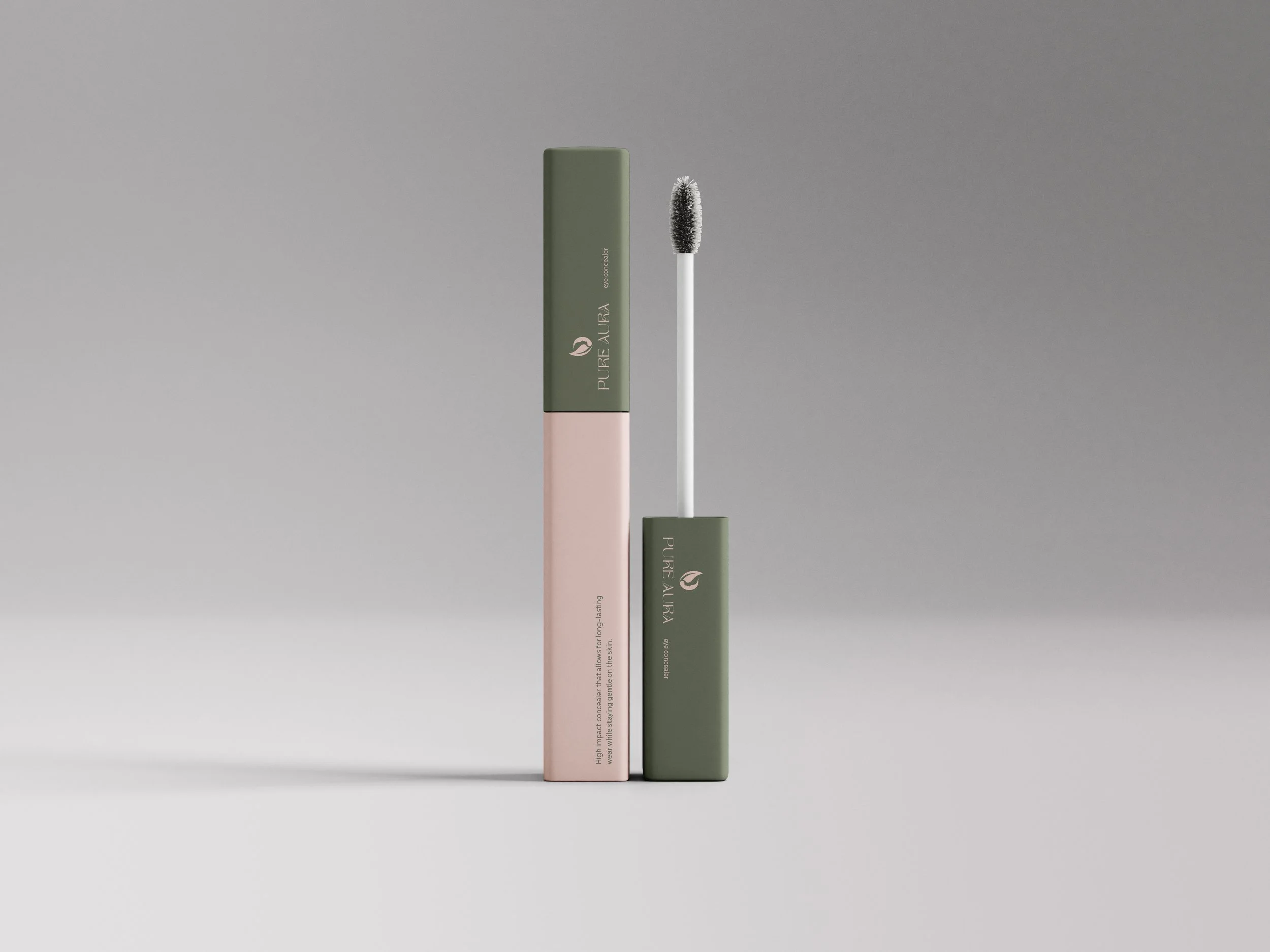
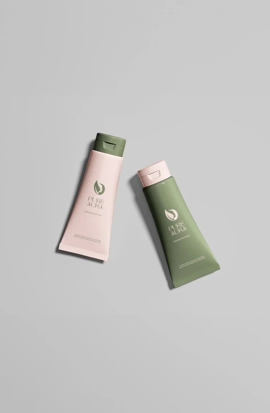
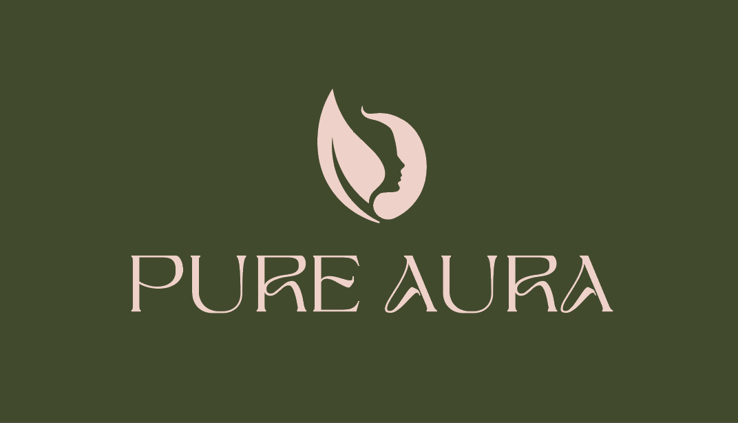
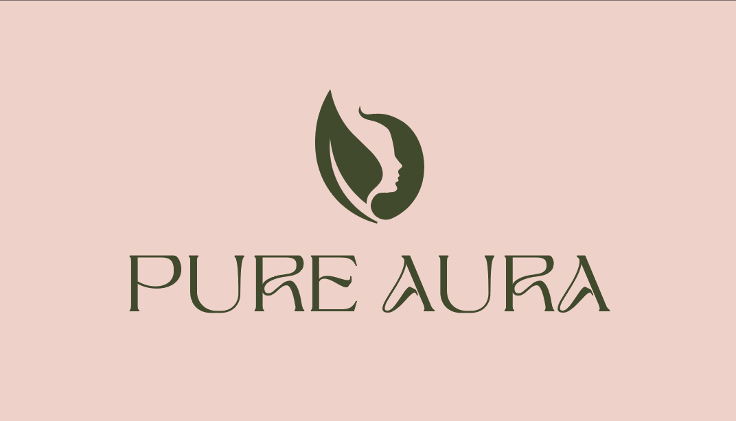
The Pure Aura symbol, combining a face and a leaf, captures the brand’s focus on natural beauty and clean ingredients. The face represents individuality, self-care, and the importance of products that are safe for even the most sensitive skin. The leaf symbolizes the brand’s deep connection to nature, highlighting the use of pure, plant-based ingredients. This symbol reinforces Pure Aura’s vision of beauty that is both authentic and naturally radiant